Little Lord Fontleroy
This Soup Peddler business is a source of pride for me in a lot of ways, but one of my favorite aspects is something that may or may not provide much value for anyone but me... the selection of fonts that I use to design the little graphics for our food labels. I am a self-described font nerd, and I know there are at least a few of you out there like me. There may even be much bigger font nerds out there than I. There may be some who look down their noses at my font choices. I know I do the same. I scoff at vegetarian restaurants and their predictable use of Papyrus font. I lament the misuse of serif fonts on side headings. I love how the Gillman car dealership uses Gill Sans Ultra. A clever little inside joke. Like cooking, I don't have any training in design so my "accomplishments" are driven by a pure DIY spirit.
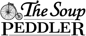
In the interest of nerdiness, I recently watched the movie (sorry, film) Helvetica. I highly recommend it. A real crack-up. It made me feel like some of my font choices have been perhaps glibly chosen. I thought back to my design of The Soup Peddler logo six years ago... I faintly recalled arriving at the choice of Monotype Corsiva, which has been occasionally pshawed by several professional designers. I still like it though. I was inspired to create a fictionalized early font analysis of the Soup Peddler logo design... you can find it here if you have the time.
